All in the name of fun and creativity, event company’s workspace speaks out playful three bold colours that perked up identity, productivity and profession.
“A citadel once started with a single block; despise no humble beginnings.” Be it an interest, a skill or a business, this quote could possibly declared as an encouragement or empowerment. Business event management company, MICEpodium would be a fitting description for a visionary workspace schemed by design expert Turn Design Interior.
First thing first, the idea is to create an open space environment of vibrance and fun. However, the challenge is to harbour minimal usage of materials. This called in a compensatory circumstance, where a composition of a Scandinavian style of light-coloured wooden vinyl flooring, clean white subway tiles. The latter is added with some glass wall and floor-to-ceiling window-framed steelworks for a modern touch which functionally divided the desired spaces.
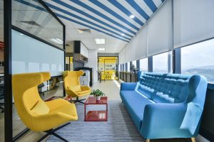
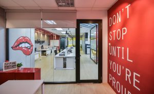
Now, with MICEpodium seen as a professional embodiment; the minimal approach definitely depicts the brand’s value. All would agree that it would not just do without its unique brand of fun and creativity. After all, this is the workstation of an event company. Leaving no room to call it quits, the design team decided to unravel a play of colours. This bold move interplays with punches of sunny yellow fever, passionate red and calmed with bright baby blue striped on certain section of the ceiling.
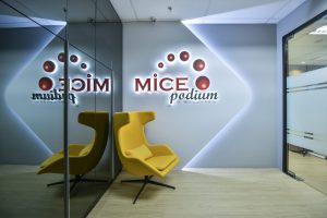
Lo and behold, the welcome lounge warmly greets with MICEpodium’s featuring brand logo graphic sticker backdropped on a futuristic built-in lighting wall. Not to mention, the meet-and-greet has a contemporary shade of the designer’s handpicked yellow armchair to comfort guests alike.
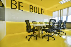
Manoeuvring austerity, the work of graphic art is further augmented within the spaces. With the yellow painting out loud, one would never guess where it settled at – the meeting room. A place for discussion, it is absolutely a space outlined for bold thinking and speaking your mind out. It then follows to the end corner of the meeting room. Pasted on the opposite side of the glass wall panel, the artwork continues with a “think out of the box” message where it is set for the light wooden, steel bar-like counter top and
high stools for a timeout.
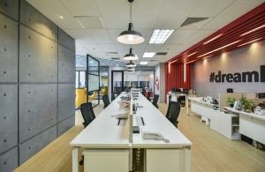
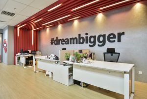
Red then takes the lead from a segment of the wall up to the ceiling, where it hovers over the workstations of the creative people who dare to dream bigger. Undaunted, a graphic of a mouth with red lips animated the textured painted grey column for a whimsy disposition. Lastly, a splash of a rather small coffee table made its appearance at the communal space among the twinned yellow armchairs and the comfy blue couch.
A one-of-a-kind design feat for business venture like this one, MICEpodium’s trade has marked its 10th year in the professional field. The commemoration of its beginning, all in a day’s work has significantly paid off with an interior that flaunted a whimsical tactfulness. No doubt, this is a win-win footing of creativity and productivity thrown in together.
For more information, visit www.turndesign.com.my
