TOUCHPOINT INTERIOR DESIGN SDN BHD
ADD: 15, Jalan Perajurit, Ipoh Garden East, 31400 Ipoh, Perak, Malaysia
TEL: 05 546 5602
EMAIL: touchpoint2001@yahoo.com
TOUCHPOINT INTERIOR DESIGN SDN BHD
ADD: 15, Jalan Perajurit, Ipoh Garden East, 31400 Ipoh, Perak, Malaysia
TEL: 05 546 5602
EMAIL: touchpoint2001@yahoo.com
Effortlessly marrying classic décor elements with modern contemporary tastes, this showhouse stylishly demonstrates what living in or even renting a home in this development could be like.
Positioned between the ‘old town’ and ‘new town’ areas of Kampar, Taman Damai is an exciting new development that is a mix of residential and commercial units. Its strategic location provides it with a significant level of affluence, convenience, connectivity and business potential. Eager to demonstrate the project’s potential as a dream home or rental property aimed at students of the nearby universities, the developers hired Ming Lee and Kit Whei to convert a two-storey shoplot into a showhouse that fulfilled that objective.
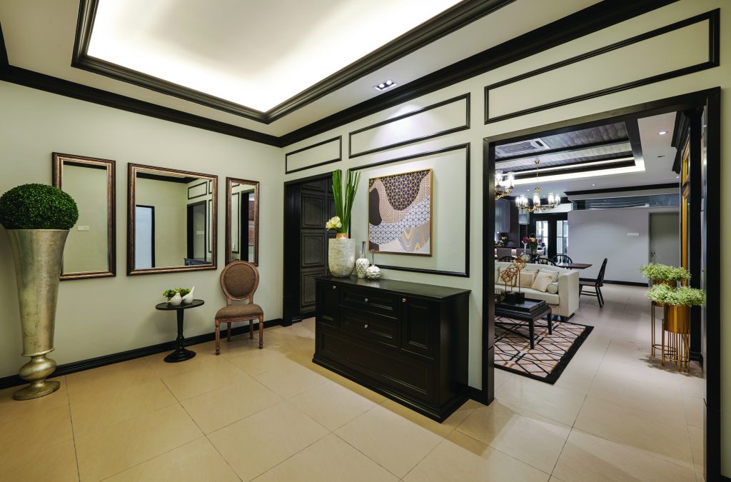 Although it takes cues from classic European interiors, the project has at its core a modern contemporary feel that ensures a fine balance between simplicity and uniqueness. This is evident from the start as the entrance of the showhouse has a palette comprised of several shades of brown which have been applied in just the right way to highlight the space’s finer details. Here, the sand brown floor tiles and tan antique wallpaper serve as perfect backdrops for items such as the dark wood cupboard and the piece of abstract art hanging above it.
 In the living area, the mix of modern and classic elements becomes even more apparent as each feature and furnishing draws attention to itself by standing in obvious contrast to another nearby detail or item. Rough wooden square wall panels cover one wall while the opposite wall has been decorated with pieces of abstract art bracket gold-framed mirrors. Adding a touch of modernity to the space is the sofa set which has been paired with a black coffee table and a geometric rug. Where the line is successfully blurred is the chandelier hanging overhead which has a mixture of the old and the new in its design.
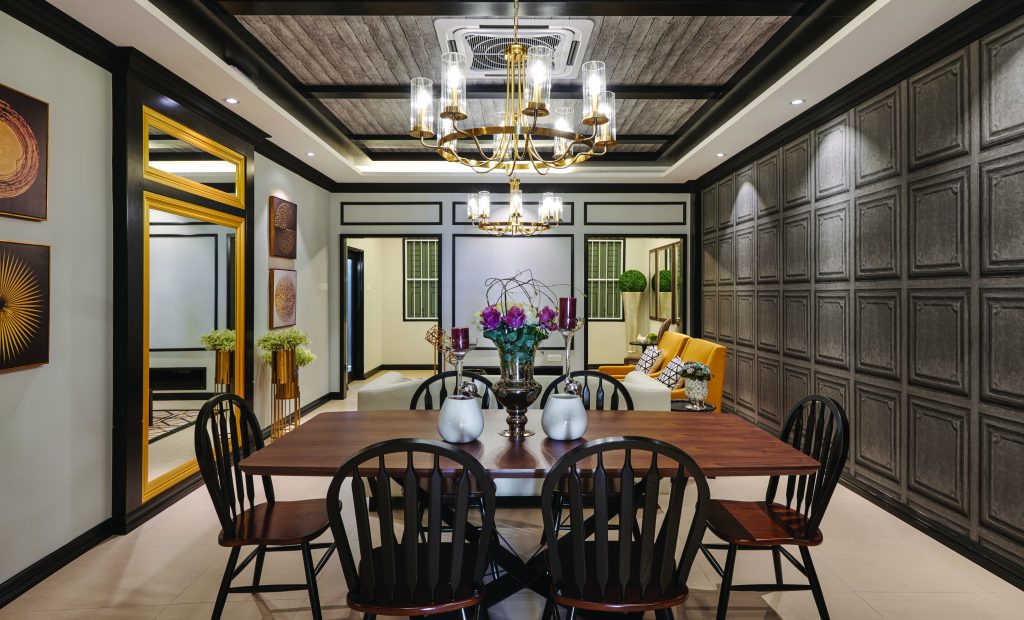 An identical chandelier was chosen for the dining and kitchen area which continues the given trend in its own way with a dining set made from beautiful dark wood and black steel. The kitchen island, however, switches things up a little by having lighter brown wood panels for its base and a laminated black top. Taking another step further away from the brown tones to establish its own identity, the dry kitchen sports a combination of grey and black cabinets that mesh well with the brick-patterned white wall tiles used here. Interestingly, this colour scheme is mostly maintained for the wet kitchen with the key difference being the choice to use intricately patterned square wall tiles instead.
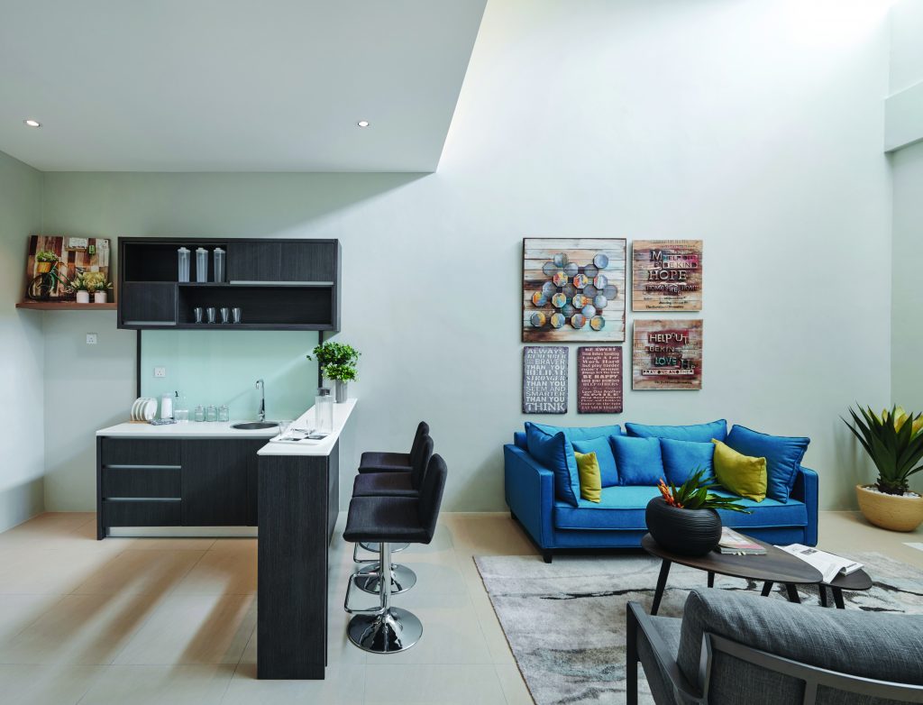 Unlike the ground floor, the first floor of the showhouse has a much more modern feel to it with its clean white surfaces and simpler furnishings such as the small kitchen with grey cabinets found here. Exceptions to the rule in the hangout area include the azure sofa and the collection of cultural art hanging over it.
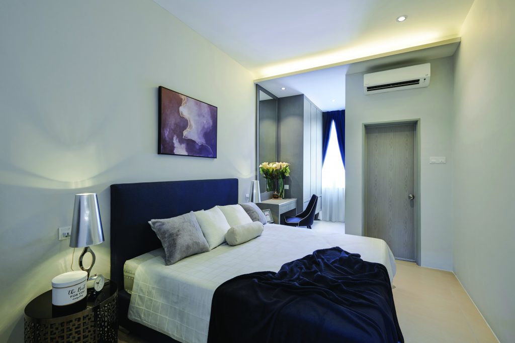
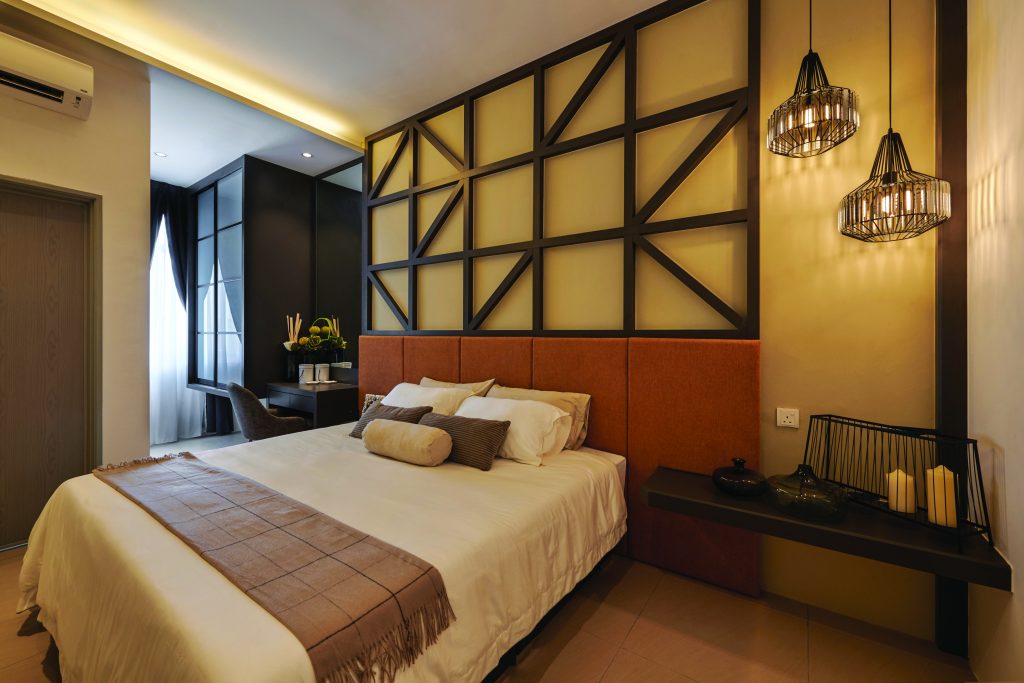 Meanwhile, each bedroom follows its own variation of this palette and has its own unique décor to further differentiate themselves from each other. For example, one bedroom has a more traditional Western aesthetic with its geometric wall frame and pendant lights while another has abstract art hanging over its bed and grey brick wallpaper where the study desk is located.
For more information, visit Touchpoint Interior Design Sdn Bhd