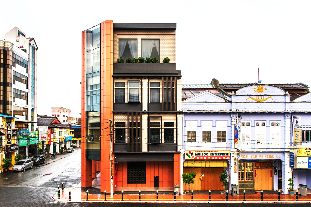
Bedecked in a façade that seamlessly merges old and new, is the office’s interior fit-out and facelift by the architects of S/LAB 10.
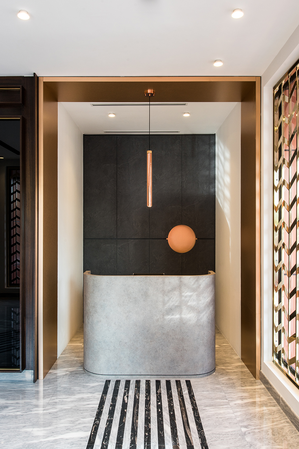
Use of Contrasts and Juxtapositions
In the entrance lobby, dark, dynamic strips of black marble stand out from an ocean of white. These work as guiding vectors that are the scheme’s first note of contrast.
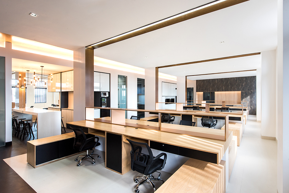
Earthier Tones and Materials
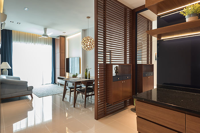
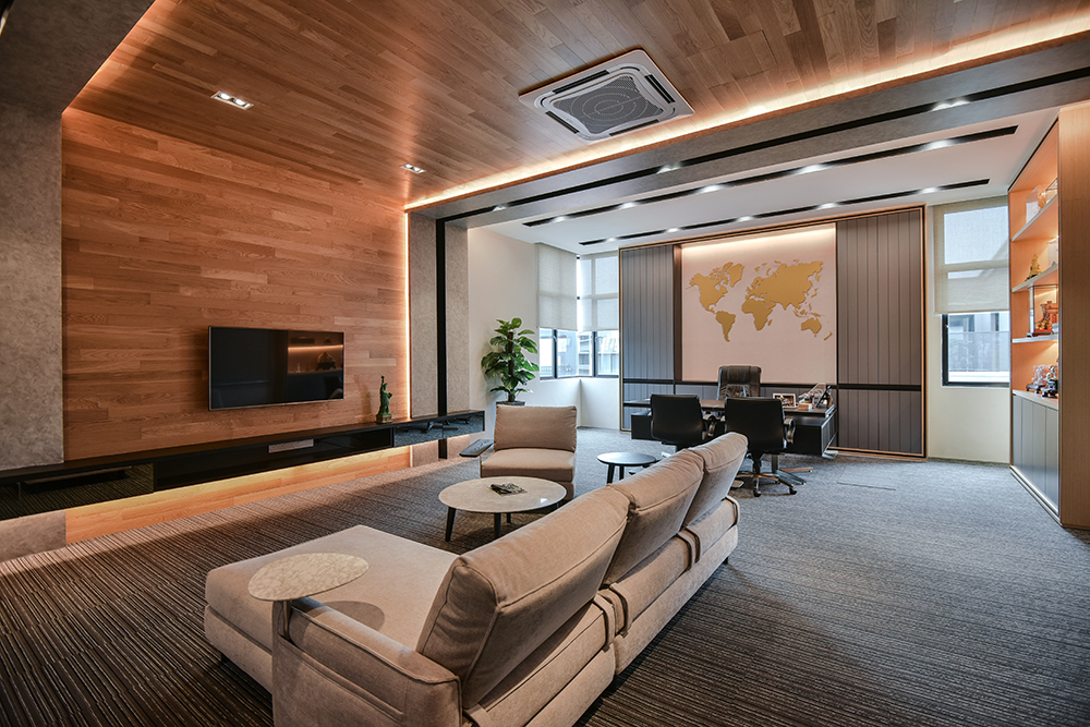
The space is a palette of neutral, natural tones and features the use of wood veneers desktops that run long and slender in an otherwise monotonously-schemed room.
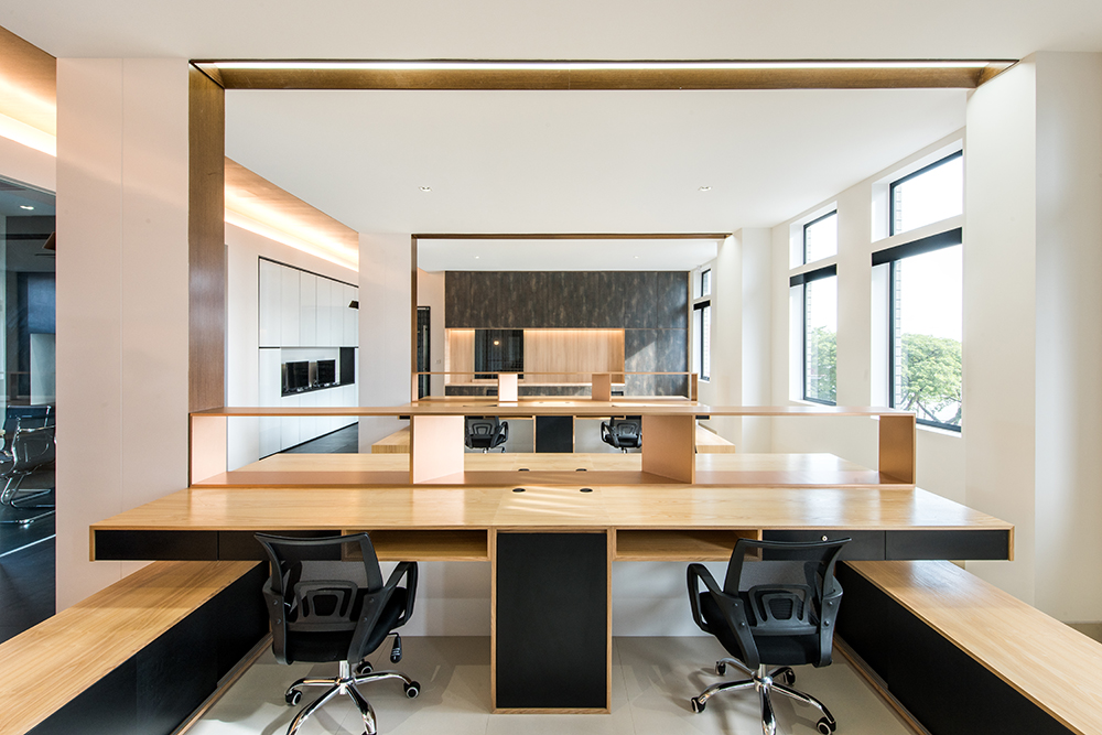
Linearity
Black horizontal drawers that run parallel to the desks, which in turn highlights the sense of cluster, depth and layer of the space.
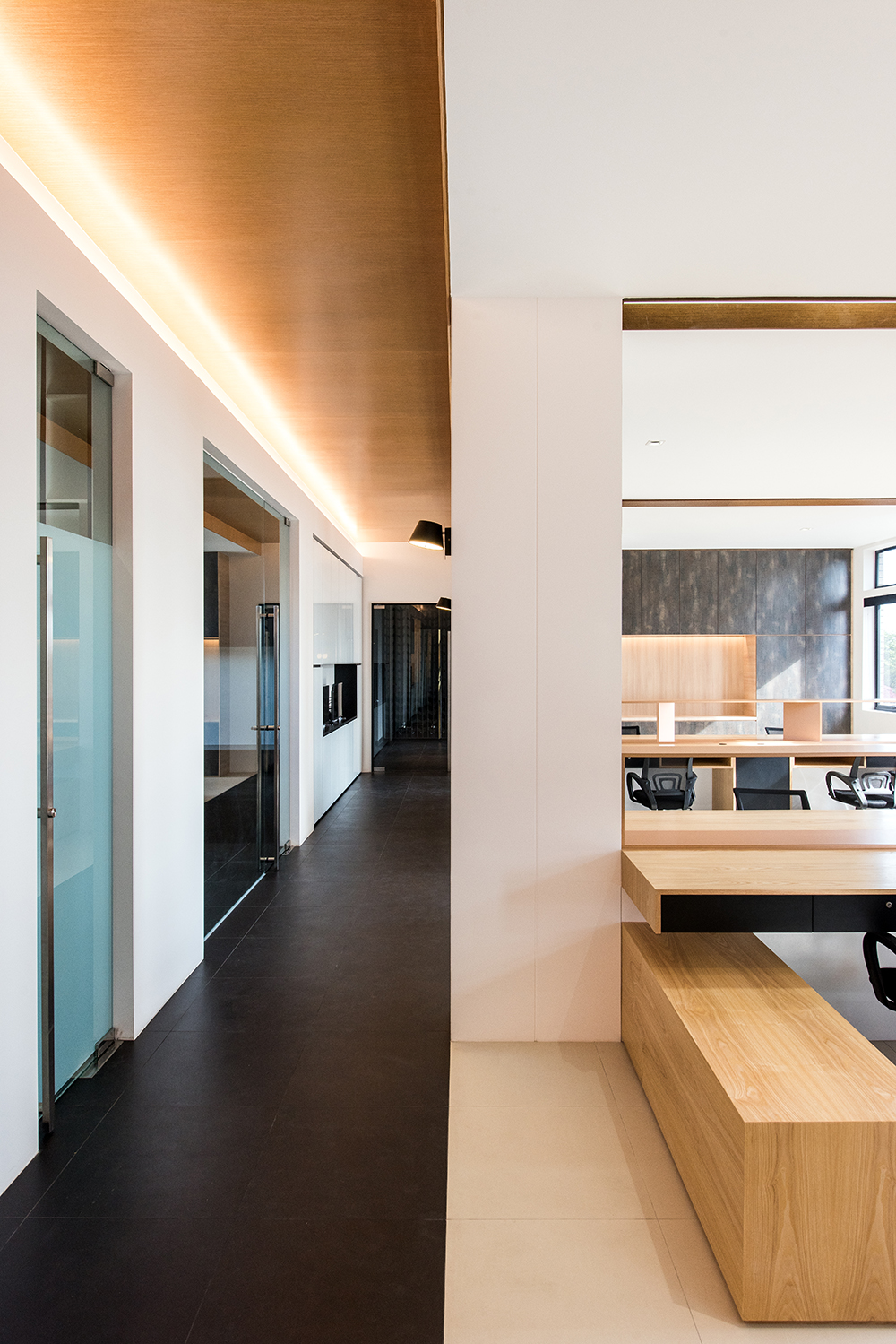
Light & Comfortable Ambience
The floors and ceiling finishes are married with and against one another to delineate the walking path down the office’s corridor.
Stark Yet Spectacular Contrast
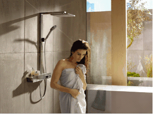
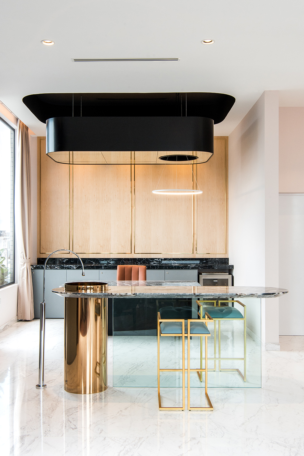
In centre of the room, stands a lean cylindrical titanium washbasin that projects upwards from the ground. As a centrepiece to the space, the island is a spectacle. It is a shining display of materials, forms and planes compositionally at their visual and aesthetic best.
For more information, kindly visit their website.
