While most restaurants and food outlets would aim to impress their diners with visually thrilling designs, the interior designer from Aura Interior has instead created a straightforward design that presents a casual and comfortable ambience. As such, materials selected are mainly based on a brown and black colour scheme, thus keeping the interior grounded and sensible with its easy-going Earth tone. At the same time, high quality materials such as Suzuka facial brick, aluminium frames and black-coloured marble surfaces are incorporated to bring out a classy vibe within the design.

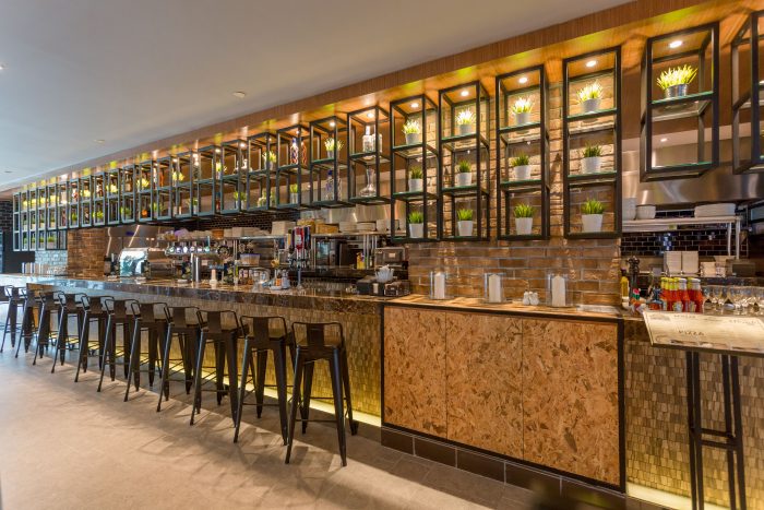
In order to make the interior appear more visually attractive while staying true to the brand identity of the restaurant, the designer has decorated the interior with a range of square motifs as illustrated through its ceiling mounted hanging shelves that separates its open kitchen from the rest of the restaurant. The aluminium frames are further coated in black to complement its colour scheme. High tables and chairs are added into the space next to the kitchen area, which successfully transformed it into a casual bar area finished with elegant marble table tops to match its black marble feature.

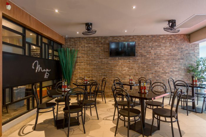
The restaurant is further distinguished into a separate casual and group dining area that is furnished with custom-made pieces to maximise the functional usages of each space to its fullest. On top of that, the spaces are given a wood grain-textured, ceramic tile flooring that offers the same warm ambience through a material that is durable yet easily maintained. In lieu of the rich design details that graced this restaurant, the designer has chosen a simple and flat ceiling as an element to harmonise the rest of its design by drawing the focus onto features that are viewed on the eye-level. As a result, the restaurant projects a cosy vibe that is designed to provide comfort through aesthetics and ergonomic features.


