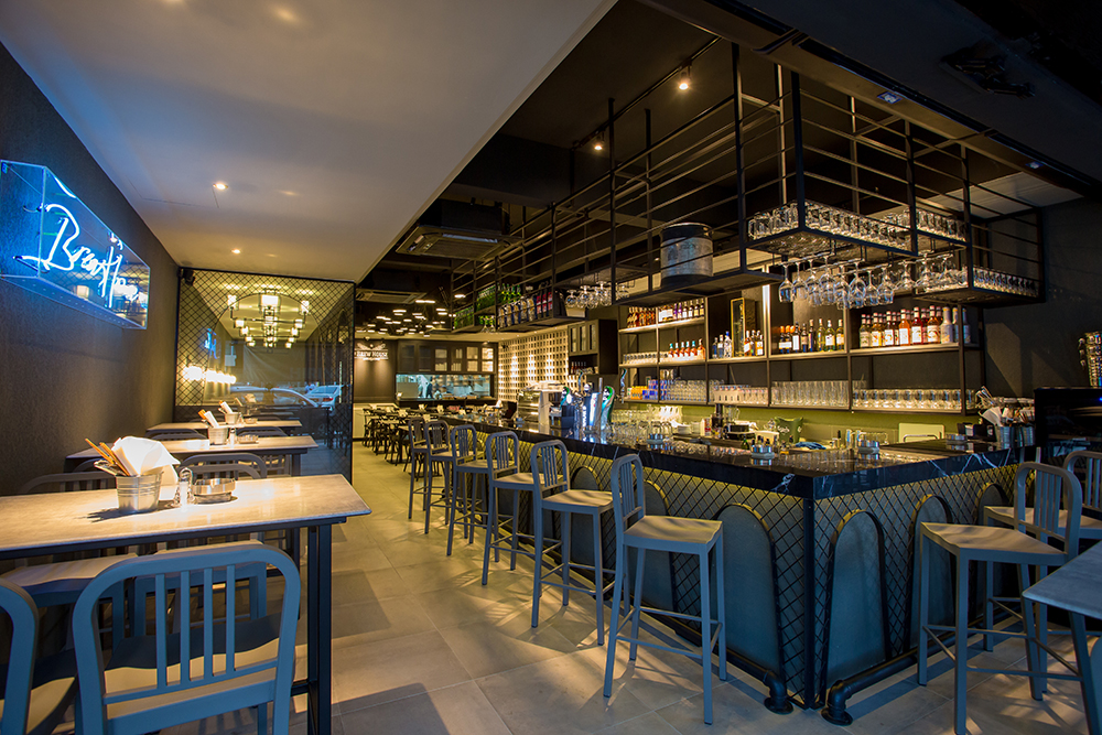
 Due to the space restrictions of this commercial lot the design team from Aura interior has proposed a simple design that optimises its space planning features though clever material selections.
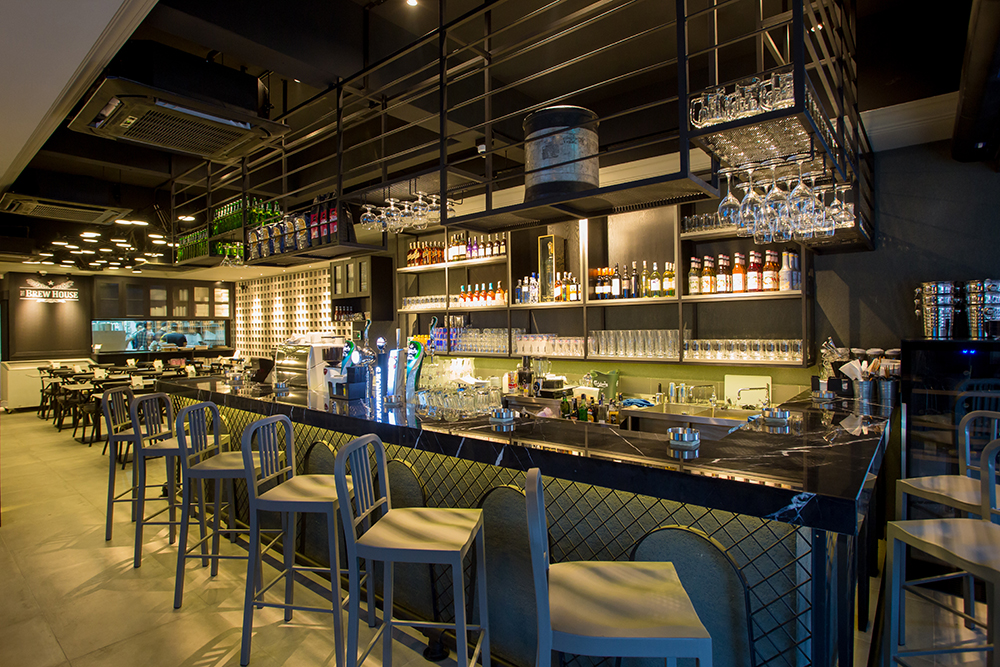 As a result, the interior has been distinctively divided into three main seating areas: the bar, the dining and the booth area. Through the use of black-matted, mesh wires and metal frames, the entire floor remains visually spacious without compromising on the intricate design features which a bistro requires to provide a suitable ambience to its patrons.
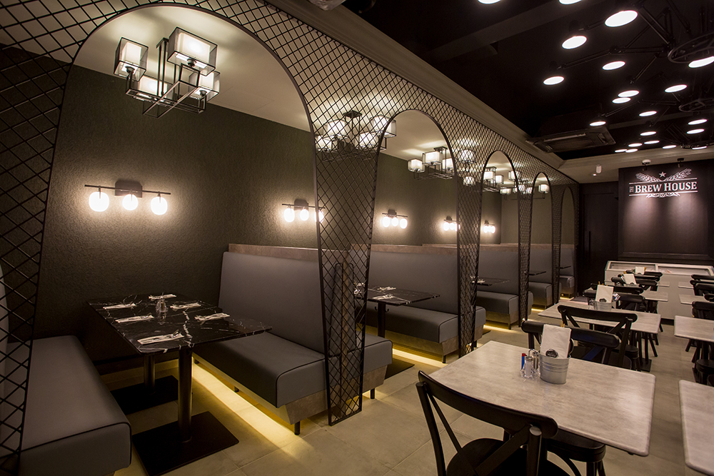 Sticking with a neutral, monochromatic colour scheme, the bistro exudes a calming sense of modernity that appeals visually to patrons of this age.
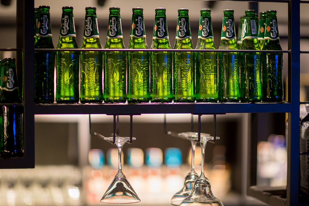 At the same time, the colour scheme selected for this design allows the interior designer to create a soothing environment by using lighting fixtures to produce shadows, which greatly dramatise its entire appearance.
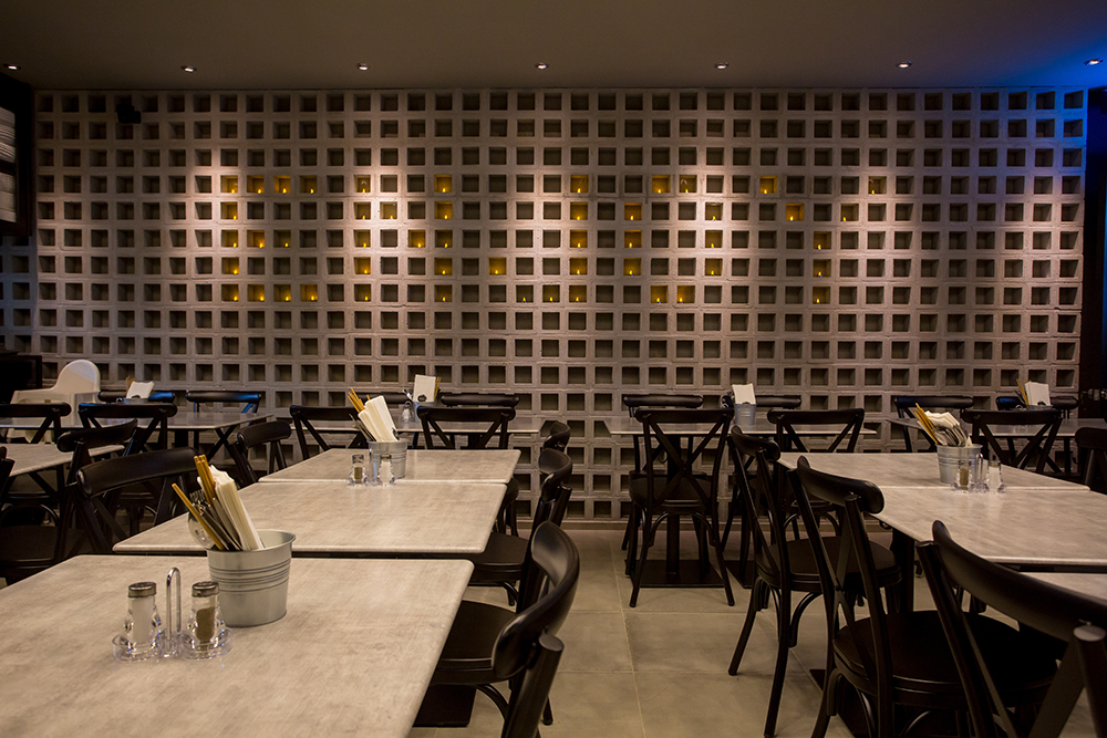 In order to style the interior further, the design team decided to decorate the walls with trendy industrial features by painting one wall completely black while the other wall highlighted with an alluring design made up of concrete blocks which are further spruced up with candle lights arranged to spell customised messages to its patrons.
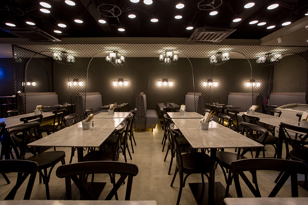
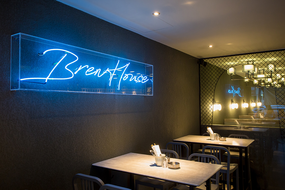
As for the finishing touch, the entire interior space is equipped with modern industrial lighting fixtures and LED signages.
Words by Elizabeth Dass
