For this Thai restaurant, Moonlit Inspiration opted for a clean and primarily white design that manages to be eye-catching without taking the spotlight off the food.
Thai cuisine has been a long-standing favourite among Malaysians especially those living in the states close to the country’s northern neighbour. As such, it is not all that hard to find a Thai restaurant especially when walking around in one of the Malaysia’s many shopping malls. Because of this, however, every Thai restaurant needs something to help them stand out among the crowd and this is usually achieved through its decor.
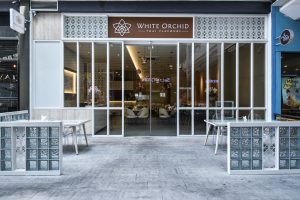
White Orchard Thai Flavours, when faced with this very issue, sought out the talented services of interior design firm Moonlit Inspiration Sdn Bhd. The company was given the task of transforming a lot in Imago Shopping Mall in Kota Kinabalu into an authentic-looking Thai restaurant with a design that would not fail to capture people’s attention.
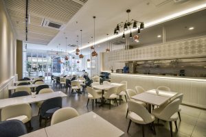
Having made the decision to draw inspiration from the name of the restaurant itself, the designers chose to go with a primarily white colour scheme. However, they decided to forgo replicating the complex beauty usually associated with orchids and paired that colour scheme with a minimalist approach. Instead, fine details which add depth and personality can be found in specific elements of the establishment’s design.
These design choices are evident in the entryway of the restaurant itself which features white-framed glass walls and doors. Two small sets of glass-topped white tables and clear plastic chairs flank the short pathway inside, bracketed by low walls that are decorated with tempered glass blocks and strips of intricate latticework.
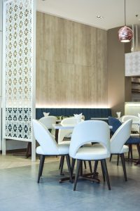
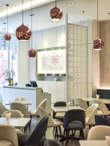
Inside, the predominantly white colour scheme is paired with flooring that is half light brown wood and half smooth grey tiles and complemented by bronze pendant lights hanging from strategic points on the ceiling. The walls of the restaurant are similarly decorated with white textured tiles that frame the restaurant’s signage behind the cashier counter and wood panels in the dining area. Adding a touch of intricacy to the space is a panel of latticework that serves as a divider which separates the cashier counter area from the dining area.
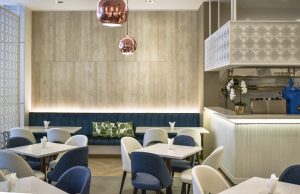
Latticework of a similar design can also be found above the drinks counter which faces the main dining area where a large portion of the tables and chairs are also white and there is a black spider lamp hanging from the ceiling. Adding a welcome splash of colour to this scheme is the small number of deep blue chairs that have been paired with the existing setup. A stretch of bench seats along the wall between the divider and the drinks counter contributes to this effort, being the same shade of blue and decorated with a few leaf-patterned throw pillows.
For more information, visit www.moonlit.com.my
