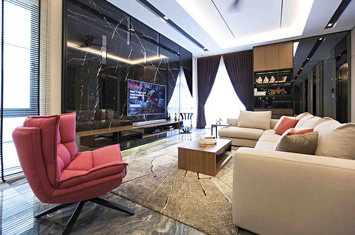
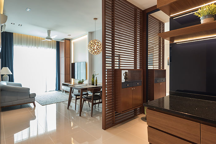
Proving that you do not need an extension to provide additional space for an interior, the designers refurbished the existing house with a contemporary open space layout through major structural modifications, breathing new life into its existing space. A simple neutral colour palette is selected to complement the modern vibes of its intended design. At the living room, the designers have went with a sleek TV console made out of a combination of black and wooden surfaces. Meanwhile, the TV panel wall is laminated with high-quality material imported from Singapore that further enhanced its overall aesthetics while ensuring that the feature is easily maintained.
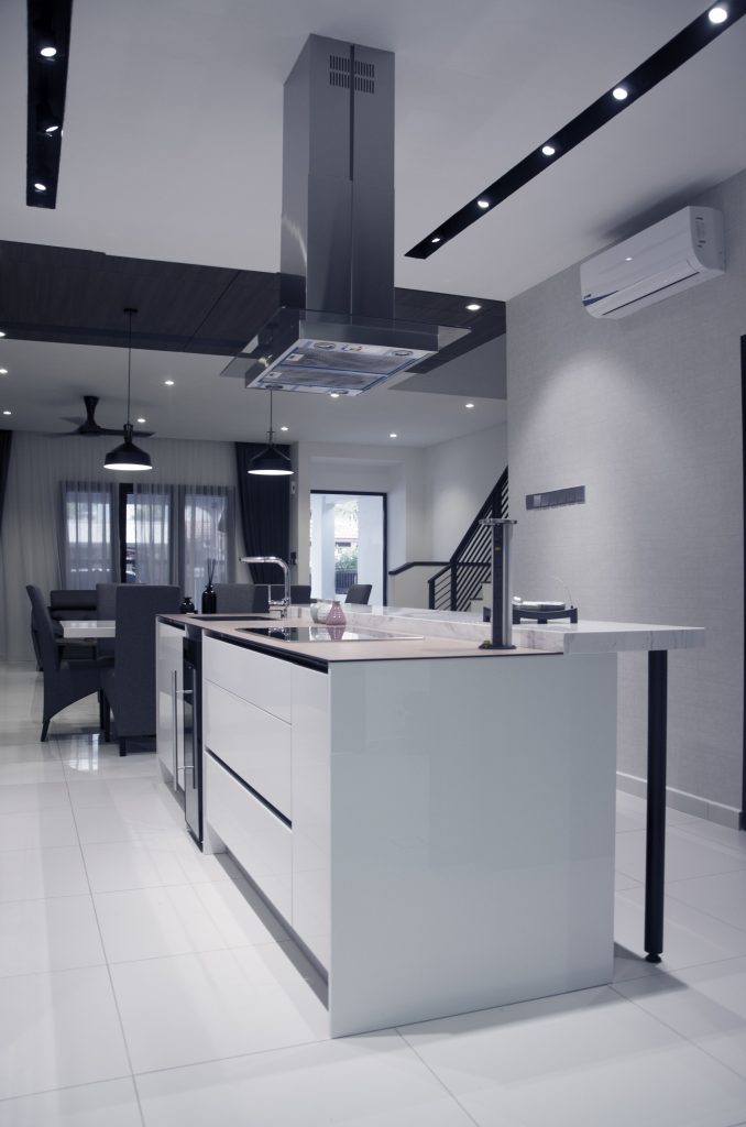
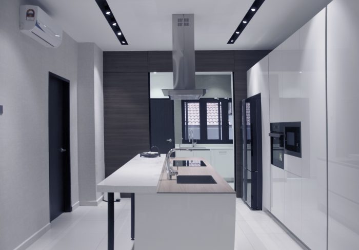
A variety of wall and ceiling designs are used to differentiate the spaces within this open space. As such, the dining area is decorated with a gorgeous wooden ceiling, while the dry kitchen next to it presents a smooth white ceiling with carved-in pockets equipped with track lights that also enhanced its overall aesthetics. Featuring a gallery-style design, the dry kitchen is fitted with a multi-functional kitchen island used for meal preparations and casual dining at the bar counter that is added on top of the counter. Mécila designer cabinets were incorporated into the space to offer additional storage spaces while they are designed precisely to house essential electrical appliances as the overall combination of design elements have actualised a kitchen space that is favoured by modern families. Separated by a tinted sliding glass door, the tight wet kitchen space is furnished with an L-shaped kitchen counter as a practical solution to its layout.
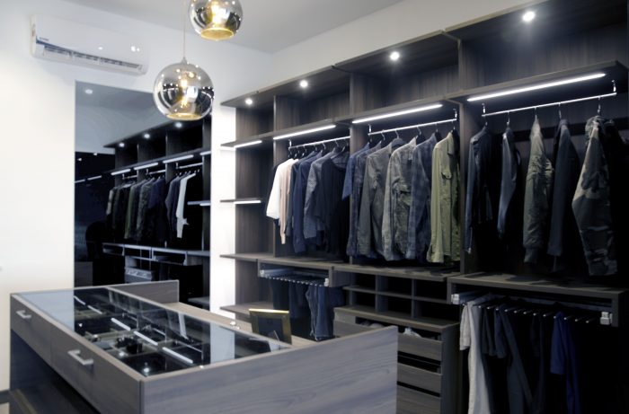
Aside from its common areas, the designers have also given the master bedroom a structural makeover to rationalise its space usage. As a result, the extra space within the room is converted into an exclusive proper walk-in wardrobe that is enclosed with sliding room and decorated with sleek lighting fixtures. Instead of a run-of-the-mill wardrobe cabinet, the designers have provided a complete Mécila wardrobe solution equipped with compartmentalised storages for various apparels and accessories, along with a standalone counter in the middle that serves as a storage display for belts and timepieces. Last but not least, the master bathroom has been reworked into a hotel-inspired luxury, which features a lavish double vanity, a spacious standing shower, custom shelves and a modern greyscale wall design. Overall, the structural enhancements have succeeded in widening the interior spaces while providing natural light without the need to erect extensions.
