ST CONCEPTS
ADD: 1M, Jalan Gottlieb, Bagan Jermal, 10350 Georgetown, Penang, Malaysia.
TEL: 012 422 9332 / 012 422 3233
EMAIL: askus@st-concepts.com
ST CONCEPTS
ADD: 1M, Jalan Gottlieb, Bagan Jermal, 10350 Georgetown, Penang, Malaysia.
TEL: 012 422 9332 / 012 422 3233
EMAIL: askus@st-concepts.com
By utilising deceptively simple colour schemes and carefully selected furnishings, ST Concepts successfully gave every space in this luxurious condominium unit its own distinct identity.
In Penang, space can be considered a luxury all on its own and this sentiment holds even more weight when it comes to locations like its capital city Georgetown. Afforded both said luxury and all the benefits of living in the aforementioned city, the proud owner of a 1,800-square-foot condominium unit here wanted that exclusivity taken to the next level. Simon Yew and Terence Tang from ST Concepts tackled the project with great gusto, smoothly combining the homeowner’s personal preferences with the firm’s signature classic European aesthetics.
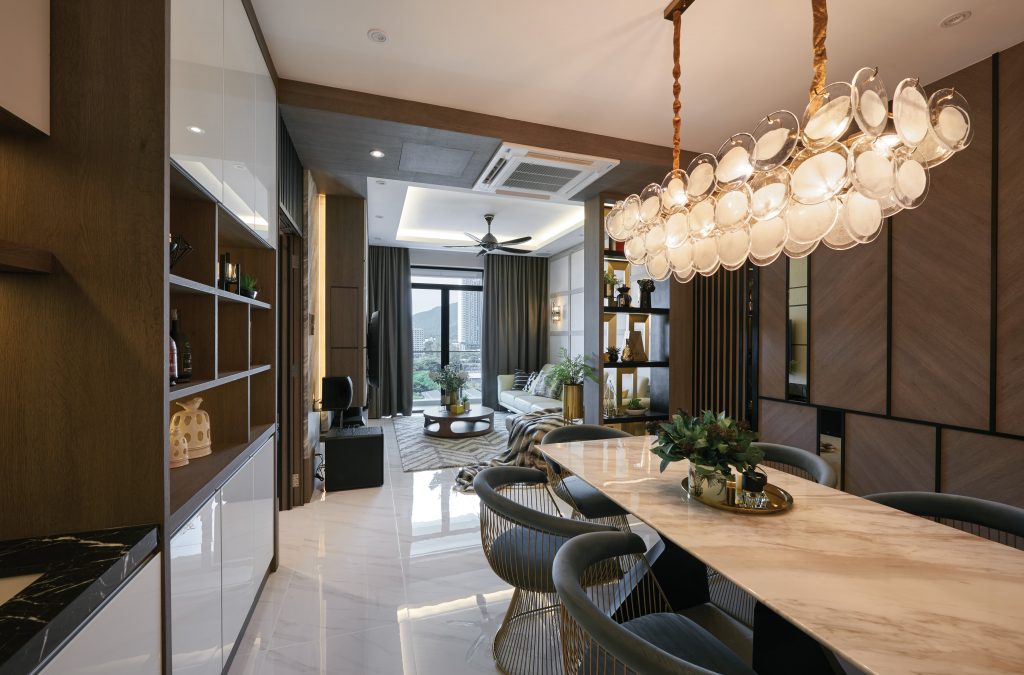
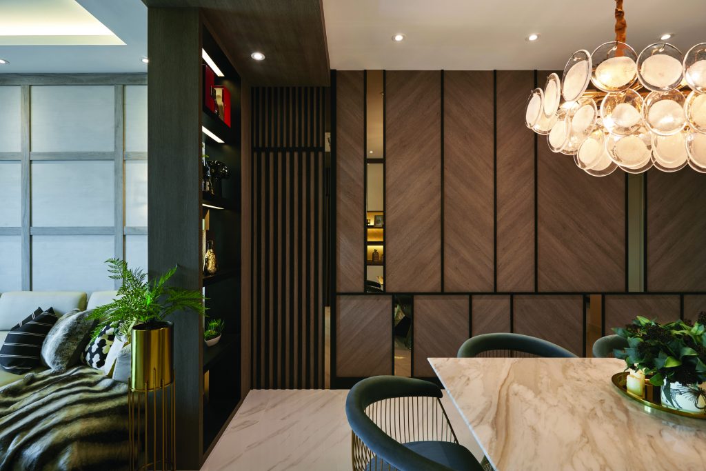
 Boasting a palette comprised of white and warm earthy tones, the dining and kitchen area is an exercise in understated class. The white marble floor tiles and white ceiling give the space a clean and crisp look while also helping to keep the focus on the other details in the room. This undeniably includes the wall covered with rich brown wood panels and thin mirrors which are all outlined with thin black strips. Another eye-catching element is the chandelier which looks like it is made out of three levels of glass plates. Not to be outshined, the dining table sports a beautiful brown marble table-top while the dining chairs add a great deal of character with their cage-like design.
 On the opposite side of the wood panel wall near the dining set, a floor-to-ceiling cupboard maintains the set colour scheme admirably with its wood frame and white doors. Aside from the collection of quirky knick-knacks occupying its shelf space, it blends seamlessly with the cabinets belonging to the small kitchen right next to it. Another detail that differentiates these two is the Nero Marquina marble used for the countertop and the stretch of wall right above it. Making the most out of every square inch of space available is a solid wood kitchen island extending out of the wall next to the kitchen which has small pockets of storage space in its side.
 In contrast, the living room establishes its own personality by adopting a more monochrome palette from top to bottom. Partially separated from the dining area by a black floor-to-ceiling cupboard with irregular slots made to look like picture frames, it has been furnished with a white leather L-shaped sofa and a grey herringbone-patterned carpet. The white geometric panels behind the television help the television cabinet stick to the colour scheme while its dark wood frame adds some variety to the mix. However, the visual standout here has to be the circular partially hollow wooden coffee table in the centre of the room which provides personality and storage space in one chic package.

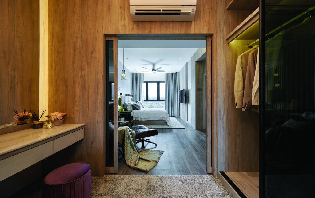
 A variation of this colour scheme was used for the bedrooms which trade the black for steel grey and standout features for subtle decorations. Grey wood covers both the floor and parts of the walls, serving as a kind of canvas for details such as the square diamond pattern covering sections of the master bedroom’s walls. In order to add a touch of character, a stainless steel bedside table was added and the bed’s grey wall-mounted headboard was flanked by wall lights made out of brass tubes. Meanwhile, the glass sliding doors past the dark grey lounge chair in the corner separate the main area from the walk-in wardrobe which is illuminated by a chandelier shaped like an upside-down closed lotus flower.
 The other two bedrooms are no less impressive and unique despite their shared colour scheme with one bedroom boasting a bird’s-eye view of the bustling city below. Storage space is not an issue here thanks to the floating wall shelf above the bed and the full-length wardrobe which has mirror-covered doors. Designed to be shared by younger children, the other bedroom sports cool bunk beds and a small study area where they can do their homework.
For more information, visit ST Concepts